Wednesday, 3 September 2014

Summer project post 2.


Lucy Brown.


It is the presentation of her work and the installation that attracts me to the work of  Lucy Brown. I love the way in which she fills a space with her work. Although Brown makes use of old pieces of garments and fabric in her installation, the work in a way reminds me of threads and in certain areas knit, which I am very interested in as I think I will be specialising in knit this year but also cross into embroidery making use of the techniques I learnt last year to integrate into my knit work. 

Dana Barness.

Again, the installation art work of Dana Barnes is a good example of the kind of context I would like to work towards, creating pieces of work to fill a space, and responding to a space by thinking about ways of creating space, line and structure within it. I also really like the way that Barnes has created such large, sturdy looking structures through knit, which Is usually seen as being quite soft and flimsy- this is something that I would like to create myself, as within my drawings I am focused on structure, line and shape which could be difficult to represent through a simple knit sample, but I am hoping that making use of embroidery skills I have learnt will make this accessible.


Ealish Wilson


Textile artist Ealish Wilsons work attracted me due to the  way she has created structure and line in unusual ways. Her use of fringing and pleating is something that I'm really interested in due to my love for both knit and embroidery. I also find her colour choices really nice, and would like to spend more time myself getting to a stage where I am confident with use of colour within both my visual research and samples.
 
Summer Drawing sketchbook.


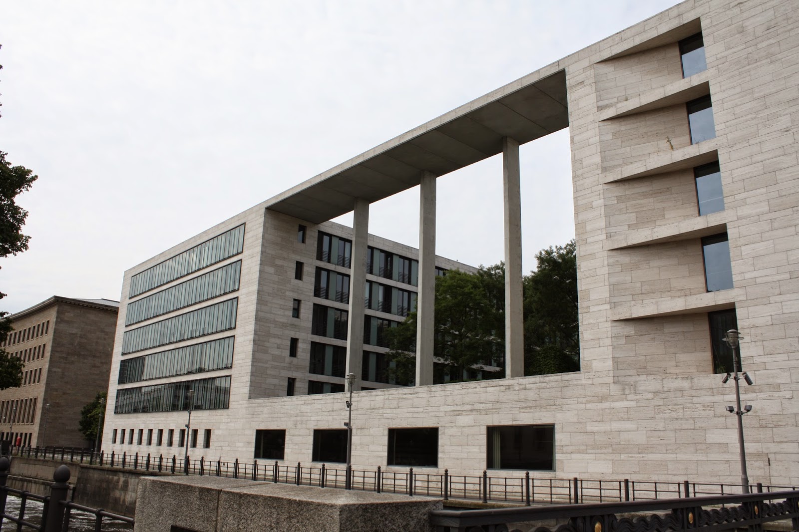
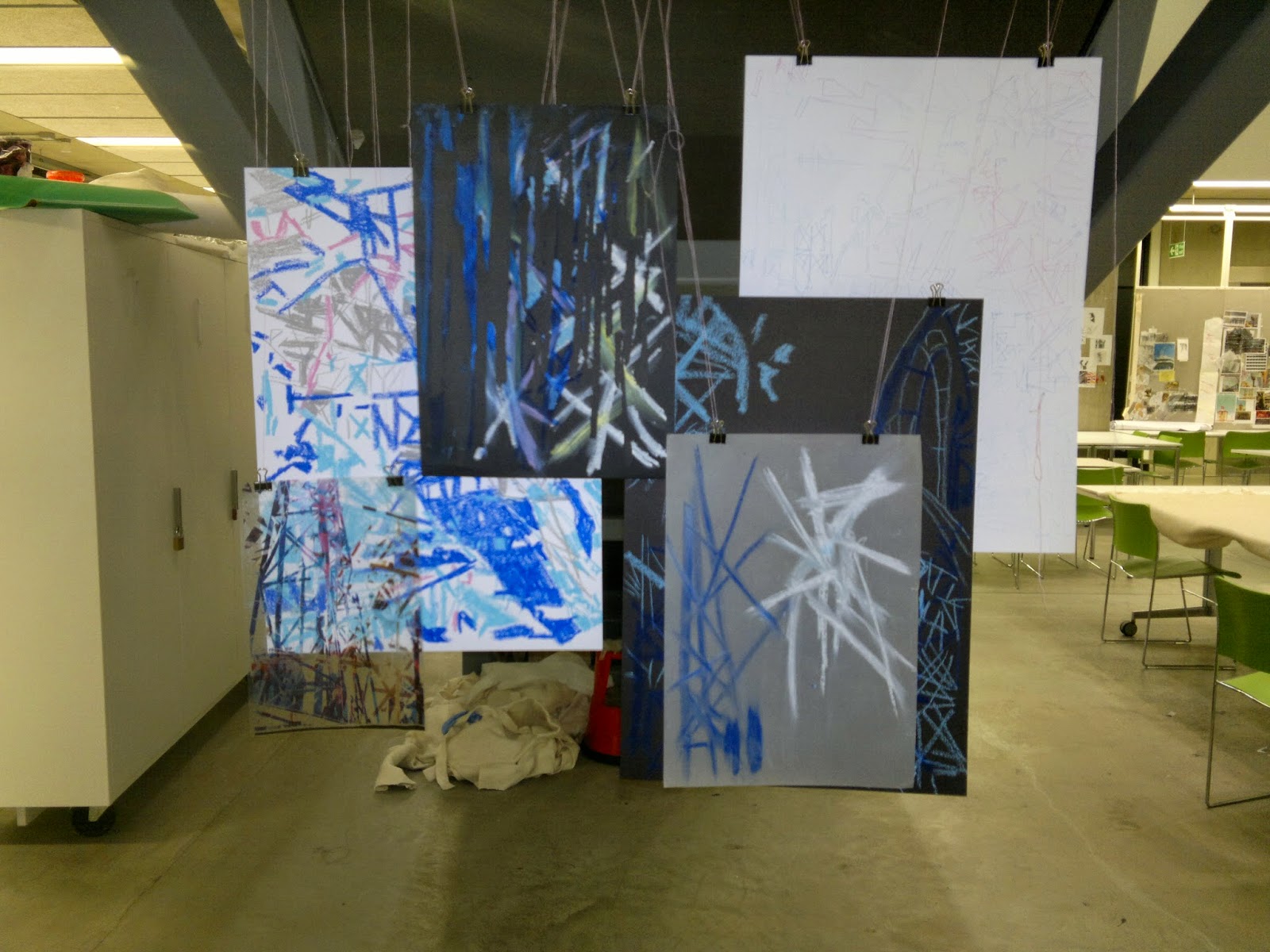
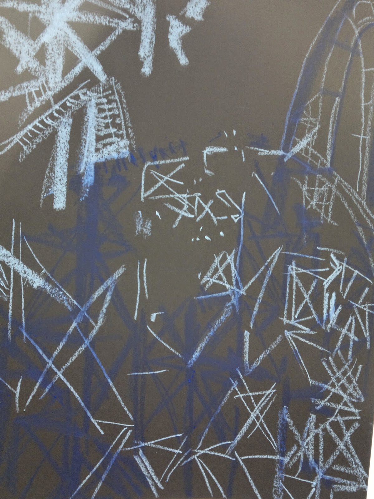
As I have expressed in the previous blog posts I have been very inspired by line, shape, space and especially architecture over the Summer due to my visit to Berlin and gallery visits so I have been experimenting with these key points throughout my sketchbook over summer. I have been focussing on the quality of line, composition, exploring shapes, collaging and layering. Overall,  I think that I have started to create some interesting ideas and pieces which I would like to push and further explore in 2nd year and work into my practice/specialism.


Tuesday, 2 September 2014

Summer Project post 1.

David Ogle.


I was very inspired after attending a talk by David Ogle due to his interesting ways of developing his art installations from his drawings, but also his drawing technique. I particularly like the way his drawings are mostly repetitive, and are focused on quality of line and shape but also composition and are done in . For me, drawing is highly important in the way I work, as I like to transfer my use of line, shape, space and composition into the sampling I do in textiles or final piece. Ogles installations are site responsive which is also something that I could see myself doing in future exhibitions or final pieces, as I like the idea of my final piece being influenced by the surroundings and not purely my sampling and drawings. This interest came after my last unit of work for unit x, when I hung drawings in an old office space, which meant I had to respond and work with the space that I was given.


Degree Show.


Visiting the degree show was a fantastic opportunity and also very inspiring seeing the different types of context and outcomes that comes from students not only on the textile course, but a range of creative courses. I always seem to be drawn and inspired by more art or craft type work rather than fashion or interior, and I think that this will be the path I'll go down in terms of my own work, producing one off pieces. 


Claude Parent exhibiton at the Tate Liverpool.


The way Parent transformed this exhibition space in the Tate gallery into a room filled with different shapes, angles, and edges allowing the audience to experience a gallery in a completely  different way than they usually would really grabbed my attention. As a textiles student I find the work of architects really intriguing, which I think is why I found this exhibition so interesting. I also took to looking at some of Parents other work, and I also love his drawing work of his architecture plans, as I found a likeness to my own drawings that I've been doing over summer.

Berlin-
architecture
I think getting the chance to travel to Berlin this summer has definitely given me the most inspiration in terms of my summer project and drawing work. It was the amazing different scales, shapes, age and style of the buildings that swarmed the city that really inspired my work and thoughts for the project. As I learnt in unit x, I am very interested in creating line, shape, space and layers in my practice- both in drawing and in any final outcome I may produce. So getting this chance to see so much different architecture was a great opportunity.

Jewish Museum Berlin.


The whole design of the architecture of the Judaism Museum in Berlin by the architect Daniel Liebeskind is beautiful and so powerful in holding much meaning for Judaism. On arrival to the museum there is a statement from Liebeskind explaining the way that he wanted to create the building so that it contained "void" areas which where empty and dark and not used in the gallery and also the way in which he wanted to leave the architecture of the building and the idea behind it to be thought of and interpreted by the viewer, rather than it being explained which I think is a really nice concept. 
Overall I was attracted to the planning of space and the lines made through this building both inside and outside, and also the way in which the structure created certain points of light in different areas which created certain emotions and feelings from the audience. 


Friday, 9 May 2014

Drawing and Film Week 6

My final week in drawing and film has been spent finalising exhibition ideas and finishing off editing and drawing. My last group tutorial was really helpful in my decision making for what my exhibit will look like, along with an exhibition planning sheet, which made me think about equipment and space I'm going to require. This whole exhibition process has definitely been a learning curve for me by having to think about working alongside so many other students and fighting for space and equipment. 
My exhibition will include a variety of drawings which work well together that I've produced over the last 8 weeks in unit x, I love this collage way of working things together. In order to get the drawings to fit together rather than them look thrown together, I have considered and really thought about the lines and colours in them and how they could look together. Also, with use of the overhead projector, I will be projecting my Photoshop imagery on top of areas of my drawings which seems to tie them all together nicely.

selection of drawings.

 The way my drawings will be exhibited will depend on the space I am given and the style of the exhibition space. It will be a response to the surroundings. As practice and to get an idea of my ideal display I have been experimenting with different compositions and suspending in the studio this week which has increased my confidence in what I will be doing for the exhibit.
My ideal exhibit would be my drawings suspended at a distance away from each other from the ceiling, allowing the viewer to not only see them through each other and straight on, but also to walk around and in-between them. I will attempt to get as close to this as possible for my exhibit, but due to space constrictions I will make the best of what I get given.
As discussed in my tutorial, I have developed my cut work drawings more this week, as seen in these images. I really love the effect of the cut open flaps on the large scale print out of my Photoshop imagery, inspired by Sachin Tekade's cut paper work.


 By hanging strips of acetate and drawing onto rolls of paper, I have moved out of the squared shape restriction that my other drawings seemed to have without these hanging strips.

Experimenting with suspension and compositions.


cut work into large scale print.

behind view.


Experimenting with projection onto drawings.

strips of hanging acetate.

Supporting video for exhibition film reel.

Reflection.
I have really enjoyed drawing and film for unit x, along with getting the chance to learn new skills in an area that would not normally be associated with textiles. I love the broad context of textiles and the many opportunity's within it. Having the chance to work as a group of students in the same studio has been great and definitely more inspiring for me as a student than working alone with no space to leave my work or present my ideas. I'd love to of had more time too develop this work possibly into constructed fabrics, but these never ending possibilities to units of work is what I find so great about it.

Thursday, 1 May 2014

Drawing and Film Week 5.

This weeks group tutorial has helped me to recognise where I'm succeeding and not succeeding as well. The addition of colour in my drawings is working well as I introduced last week, but I'd still like the lines to be more considered and reflective of my Blackpool imagery- so I had the idea to print my Photoshop imagery onto acetate then use an overhead projector to get the imagery onto a large piece of paper to then work onto.


I think the clarity of line I got made possible from the projected acetates is definitely a success, and I really like the abstract look the oil pastel that I have used in these drawings pictured above has given. I'd like to experiment with different drawing media to get different qualities of line which I think will make my drawings more varied and interesting to look at.

This idea of cutting as drawing is working well alongside my drawings too, and I think when suspended at exhibition as I have pictured in my head, the way the viewer will be able to look through a drawing onto another one due to these cut out drawings will be really successful. This all relates to my theme of memories fading and blending into one, which I really want to get through in these drawings and installation.
  In terms of film, I still really like the way this documenting of my drawing processes is working, and I think that these will be nice to show parts of at the exhibitions show reel to support my drawings. I like the idea of the film showing me removing/cutting/tearing away parts of the drawing- reflecting these fading memories from the past.


Diana Al Hadid Drawings.


It was the drawings of fine artists Hadid's that caught my eye due to the complexities of the light and shadows with in them, but also how abstract they are. I like the way that in sections you can make out a structure or object, but in other parts nothing. I think this really relates too my theme, but also to the look of some of the drawings I have done, due to parts of them being clear and other parts not so much.


Monday, 28 April 2014

Drawing and Film Week 4.

Contextual Reference Idris Kahn.


Photographer Idris Kahn's work appeals to me due to the technique of layering which he uses. Despite the difference in overall look and colour between mine and Kahn's pieces, I am still very inspired by the way his imagery is distorted and layered as it relates to my idea behind this unit of work in terms of fading and distorted memories.

Adding Colour.

As suggested in a tutorial before the end of term, I have been playing around with adding colour into my drawings to add more of a sense of Blackpool into them, and to stop them looking a bit dull. This has been a success. 


Photoshop examples.
Layering my photographs from the visit to Blackpool at the start of Unit X on Photoshop and using the different layering tools to blend them together has helped me to introduce some colour into my drawings, by creating a colour palette from the photographs. It has also created some really nice marks and lines and negative qualities which remind me of some of Idris Kahn's imagery without the colour. I will definitely be putting these different qualities of lines into my drawings. 

Drawing Development.


As shown in these images, I really like the colours I have developed into my drawings on top of layered masking tape and I think the consideration of lines and negative space is working much better now than my original black and white drawings. I would like to try different techniques and compositions with my drawings now, making use of different papers, sizes, layering and cut work to create more interesting drawings. Although I like the concept of the masking tape, I think that the lines created by this technique in my drawings could work better if they where more sensitive and considered.


Monday, 14 April 2014

Drawing and Film Week 3.

Projection Workshop.

Having the chance again to collaborate with other students in this workshop again was very beneficial, along with experimenting with different types of projection. Manual projection rather than digital is what I found most interesting, especially the use of an overhead projector due to the effect of drawing and enlarging it onto a surface.


  Projection workshop video edit.


Development of workspace.


This week I have been spending my time developing both my drawings and sketchbook and showing this development on my wall space- which helps me to distinguish links and points of development between my research, photographs, drawings and film making.


A group tutorial has given me lots of ideas of where to go next. I'm going to continue with my drawing ideas, and develop further with layering and cutting/slicing. I'm going to focus much more on different line qualities and the composition of my drawing- for example having a drawing that doesn't fill the paper completely and is much more considered. I'm also going to experiment with bringing colour into the drawings to see if this works or not. I think I'll do this by using Photoshop and overlaying my drawings with my photographs and bringing some colour through sensitively.
I think by overlaying this imagery I'll be able to push my drawings much further and again focus on this idea of memories of Blackpool fading.
In terms of film, I'm going to continue with the documentation of my drawings, as this is working well for me.