Monday, 27 October 2014

27th October Tutorial


The decision to move into an A3 sketchbook this previous week has definitely aided me in seeing realtionships between my drawings and research and has helped me to start planning and making choices about what I want my knits to look like. I have been trying to sketch out some ideas to get an idea of composition and technique, and I have also done some yarn wrappings thinking about quality of yarn and what kind of texture and overall feel that I want to come from my knitting.


Despite doing a variety of samples on the domestic machines this week I haven't got any that im particulary fond of, and this is definitely due to the yarn choices I have made. The thick white double knit cotton that I used as a background for most of them came from the white that is the background of some of my drawings. However, white in my samples is not succesful at all as white can be very hard to get right, and I feel like it just looks dirty and is very boring in my sampling from this past week.


However, I am enjoying the e wrap technique which I've been experimenting with and I feel like this is a technique that could be pushed and experimented with much further to create different patterns or textures over my knits, as there are some reallyt nice areas of detail in my drawings that could be represented through heavy e wrapping.
 
 
A sample which I thing has some success from this week is this e wrapped monofilament with the blue 2ply cotton. Although the samples a bit tatty and too small, the quality that the monofilament brings to the piece I think works really well. This idea of having some transparency against the solid colours of the knit really interests me and is definitely something I'll be bringing into my work a lot for this unit.
 
This weeks tutorial has given me so many ideas on how to develop my knitting more. Colour is definitely something I need to work out, and I think that instead of using the white as background, I will vary the backgrounds from extreme lights of blues/greys to extreme darks of blacks, blues then bring in flashes of other colours through the piece. Working like this will be much more reflective of the qualities of colour in my drawings and will work really nicely. In terms of technique, I will be pushing e wrap much more along with weaving in,  the use of monofilamet, grid systems, lace and ladders , partial knit to create spaces and punch cards to break pattern up over the piece. Furthermore, I need to beging thinking about what elements of embroidery I'm going to bring in to this sampling and how I will work these with my knit.
 
I also need to make sure that my yarn wrappings and therefor the yarns in my samples have an element of vibrancy in them, as the ones in my sketchbook so far don't seem to capture the vibrant elements of the colours in parts of my drawings.


Monday, 20 October 2014

20th October Tutorial


This past week has been spent developing my drawings using the points from last weeks tutorial to improve them and make them more exciting ready to go into sampling. I think that this experimentation I have been doing with different kinds of paper, transparencies and colours of baskground has definitely improved them and I'm really happy with the way they are looking. I love the use of layering and different levels of transparency blurring sections, and this is a quality Im going to be keen to transfer into my samples using both knit and embroidery techniques. 


A tutorial today has made me realise that in order to start to develop and transfer ideas from all the visual research I have done so far I need to start working in an A3 sketchbook. This will be so helpful in generating ideas and choices in terms of colour, composition, yarn choices and technique and also having the space to plan out samples in a sketchbook alongside my visual research and contextual research will make me much more productive when getting on the knitting and sewing machines in this apporaching week.


Monday, 13 October 2014

PDP Tutorial.

A one to one turorial with my specialist area tutor was really good in helping me to recognise how I can develop my drawings further this week before I begin transferring the ideas and properties of these drawings into my knit sampling.

An important thing that I was told that I need to think about before I go into knitting is the concept behind this project althrough the brief of "urban influences" has aided me in my drawings in order to go into knit a more considered concept is definitely needed. This will be key in the techniques and use of yarn, colour and compoisiton that i use in my samples, as I will be trying to communicate this concept through what I am knitting. From my drawings, I think that the concept will be based around this idea of the disection or distortion of architecture, due to the layered, broken, collaged effect of my drawings that have come from my drawings from around the city. This week I'll definitely be thinking about this concept through use of a spider diagram to think of some key words that explain this concept and aid techniques I can use in my knitting.

In terms of drawing development, we both agreed that my drawings are succesful and are much better now that I have been thinking about tones of colour and colour compettetion, and have also been developing them as collage type compositions. To push these further, Laura recommended to experiment with changing the backgrouunds and push the colour a little further to create more interesting pieces without that becoming a bit "samey". Experimenting more with composition and layering will also stop this happening
.


In terms of contextual references, I'm still massively inspired by the drawings of Daniel Libeskind due to his use of abstraction and quality of line that represents his architecture. I think that my disection and distortion of architecture through my compositional type drawings reflects this inspiration.


Also, the paintings by Cathy Read really captured my eye and instantly reminded me of my work when I saw hers whilst researching. I think it is her use of colour that I'm interested in along with the structure her drawings contain.


Thursday, 9 October 2014

9th October Tutorial


Getting the chance to have a tutorial with a textile artist was definitely a great oppurtunity for me as that is where my interests in terms of my context and where I see my work lies. So this was really helpful to get this different feedback.
(small sketchbook scans)
This has given me losts of ideas and inspiration of how to push my drawing further and prepare to go into my specialist area.


Although I have introduced some use of colour this week through blues, greens, blacks, masking tape yellow and whites, I think that experimenting and investigating tones of blues and greens will definitely help me to be more sensetive and thoughtful about the use of these colours in my drawings.

 
I am also going to experiment with photoshop, using my drawigns to create interesting new compositions to work from.
It was also suggested that I push the cut work much more, which I also think is one of the most succesful points of my drawings, so to push this further and experiment with it will be interesting.
Furthermore, although some of drawings have some intersting areas of detail and colour, I need to try using different sizes of fineliners in order to produce a better range of line quality. I feel like this will add a new dimension to my drawings and make them much more interesting to look at.
My collage idea is something that I also need to push, using parts of my original drawings and mixing them up to create new surfaces and backgrounds to then draw upon, creating layers of different surfaces and different transparencies.
 

Thursday, 2 October 2014

2nd October Tutorial.

After continuing with visual research all week in response to the "urban influences" brief a tutorial has definitely been inspiring in helping me know how to move forward this week.

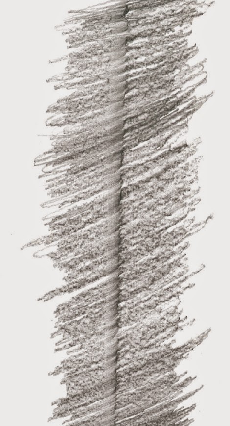
When out on location in Manchester I did some surface rubbings. These are something that was mentioned in the tutorial as a success due to the nice quality of line and texture within them. I think that I will develop my drawings making use of these in collage, as something to work on top of and create structural line drawings out of, as this is where my interests lie.

 
  In the drawings I've produced so far, I think that there is definitely room for improvement in terms of line quality, as the lines in my drawings so far are looking a bit "samey" which I know is down too lack of different medias whilst out on location. So I'll definitely be getting more experimental in terms of drawing tools this week as this will make a massive difference.


Colour is definitely something that I need to think about after this weeks work mostly being monochrome. I think that I will use my photographs for inspiration in terms of colour but also tones of colour. As a textiles student, I think that colour is somethig that I really need to play and expeirment with as it is so important.
Being inspired by mainly modern architecture makes me think that the colour could be quite complex and washy, due to the reflections and the changing of light in the glass that a lot of modern structures contain.


Daniel Liebeskend Drawings.

After visiting the Jewish Museum in Berlin over summer I have become really inspried by the work of this architect and I find his drawings really interesting. However, my drawings at the moment don't really contain the right properties of line and layers to reflect this inspiration and I think that by making the improvements I have already recognized that I need to make will definitely allow me to show this influence through my visual research.